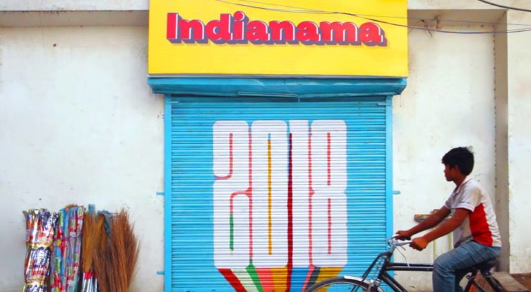
In the narrow Delhi streets, tea-stalls or departmental stores double as hangout spots where people catch up with neighbours or friends. These shops and small businesses are as indigenous to the city as its population. Their signage offer a familiar feel and add to the visual vocabulary of the street that they are located in.
For Indianama 2018: The Street Hustle, 71 graphic designers came together to conceptualise identity systems for 71 small businesses/street-side shops. They studied the store, its owners and its history and conceptualized a new brand identity system for them. This project not only hopes to help these small businesses boost sales but also hopes to colour the city streets with creativity.
1.Vaishno Dhaba
What started as a roadside thela 25 years ago, is now a dhaba which never sees a dull moment. When Abhishek Choudhary was asked to rebrand Vaishno Dhaba he decided to revive it’s lost history with a classic vintage aesthetic. His aim was to keep the design simple, minimal and nostalgia driven. “The owner of the restaurant is a simple and calm person that’s why I tried to keep the design very simple and muted too.”, Abhishek elaborated.
This visual language and décor hints at a story of legacy and lineage borrowing inspiration from the design of the parsi cafés, coffee houses & vintage packaging.
“We painted the interiors in the owner’s favourite colours, painted the floor to mimic a tiled floor, hung framed artworks of the dhabas early days on its walls. The idea was to improve the overall experience of being in the dhaba” he comments.
2. Kamal Store
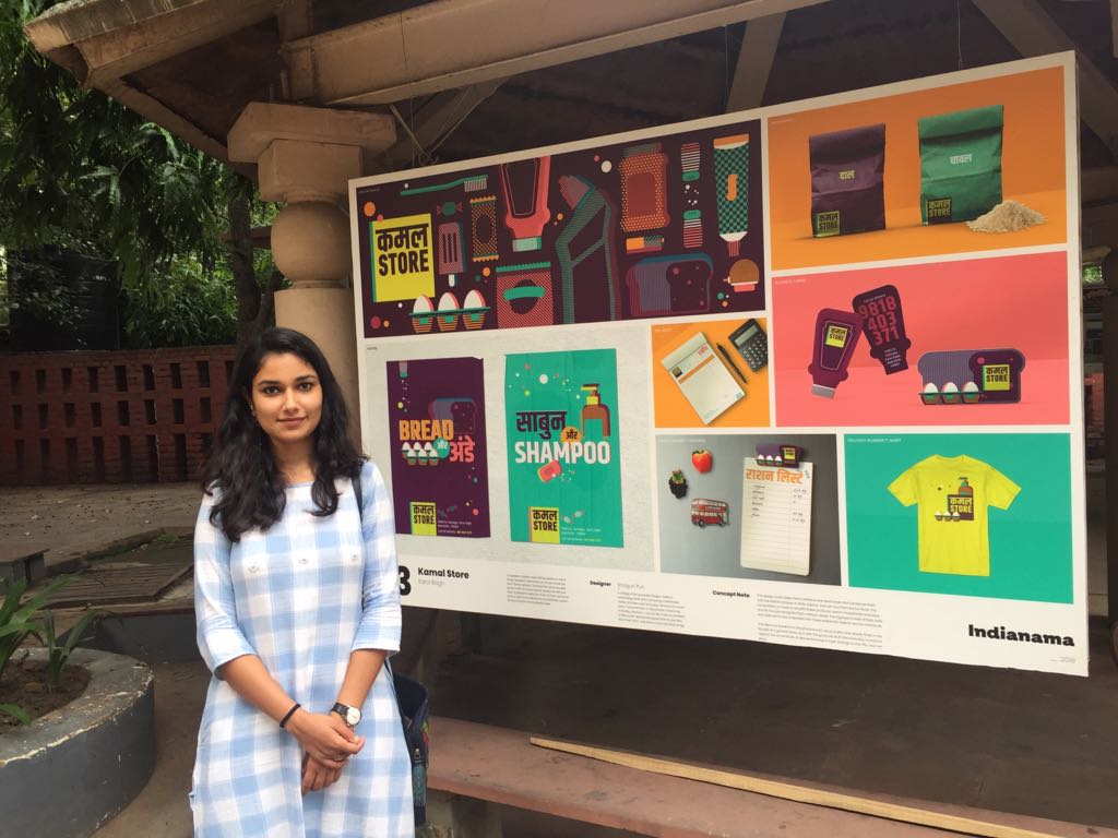
When asked to rebrand a 50 year old general store, Shagun Puri realized that it obviously had more visual clutter than major chain outlets have. So, for her, the idea was to break it with the same everyday objects with simplified forms.
“Groundbreaking design wasn’t really the idea. I wanted to solve this with simplicity in form and composition. I focused on the forms of these everyday objects, that we know the shapes and sizes of, without writing the brand names on it. And I just played around it.”
As a result, the final design is a simple, more aesthetic display of the things Kamal Store sells, like bread aur ande (brean and eggs) and sabun-shampoo (soap-shampoo).
3. Jamil Green Vegetable Shop
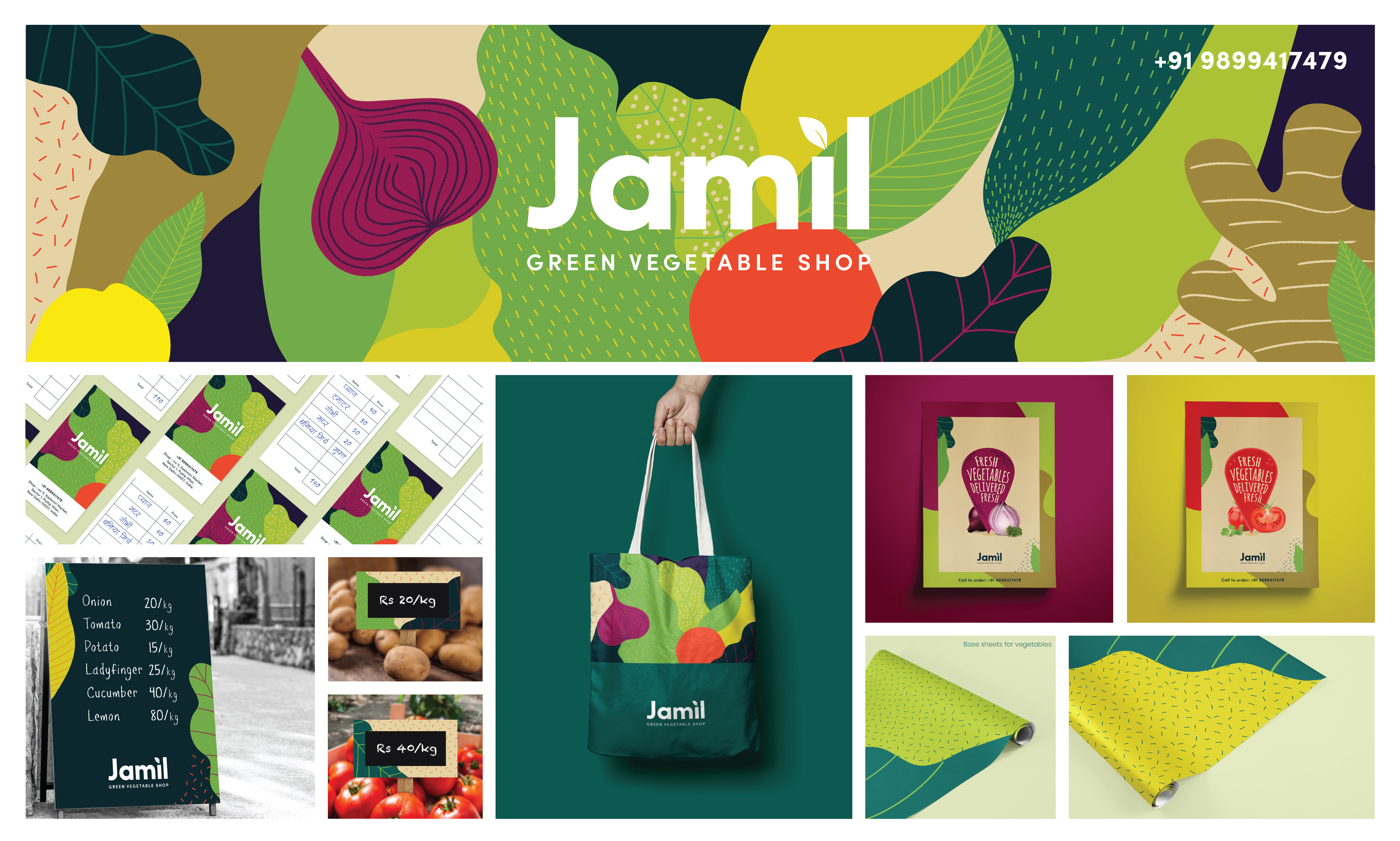
Working with Jamil, a vegetable vendor who works in Pushp Vihar, Mehak Mahajan blended his thoughts with her concept.
“The base design is a leafy dense foliage in flat illustration style drawing from the colours and shapes and colours of the produce he sells. Jamil is fond of the colour green, so I used that as the primary colour tone – and also because I wanted the colour to symbolise the ‘green’ ethos of the design collaterals.”, she explains.
The storefront logo mirrors the simplicity of the shop’s name. The simple, clean font ensures that it stays true to the ethos of the establishment, while the accent-like leaf continues to carry the ‘green’ story forward.
4. Mehfil Perfumery
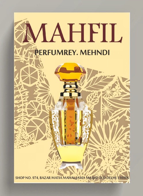
Mehfil Perfumery is known for spreading their aroma around Jama Masjid since 1947. The owner Mohammad Wasi is known for his affinity for the colour white and for brewing a special scent Attar-e-Mehfil.
For Neha Das, the most exciting part of the project was all the research work and colour scheme. “Everything about the shop was inspiring specially the location, people, culture and the vibe of the shop. After all the research work I took the essence of that place and I stuck with the idea of earthy yet royal that’s how I arrived at the final project.”
5. Super Chef Rana Bakery
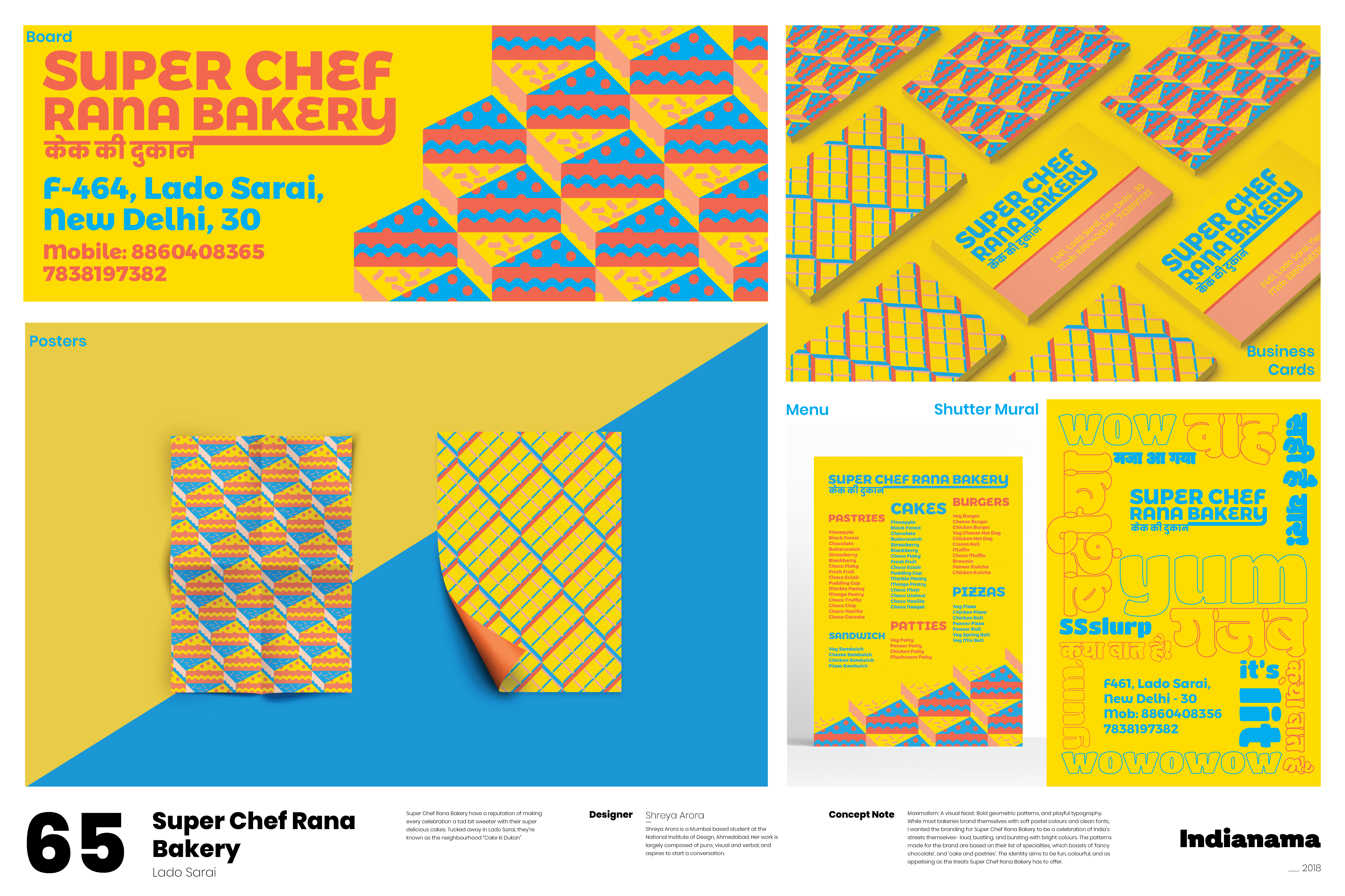
What Shreya Arora found to be a major challenge for her rebranding project for Super Chef Rana Bakery was that there were little to no restrictions from the client’s side. “He was extremely receptive and unbiased, to the point where he didn’t even have a colour preference.”, she says. We have all heard stories about clients who try to be backseat drivers and dictate the designer’s every move. So, for her, working with someone so open to ideas was extremely refreshing, if slightly demanding due to the brief (or lack thereof).
“While I love clean fonts and simple vectors, I also recently realised this is an aesthetic inspired largely by Western graphic design, and I knew I’d have to break out of it to do justice to the maximalist visual feast Indian streets are.” she explained.
Using bold patterns and bright colours to try and create a language as visually appetising as Super Chef Rana Bakery’s treats, Shreya tried to break out of the rigid grids I usually adhere to, both for the aesthetic and the process.
6. Rajdhani Stationary
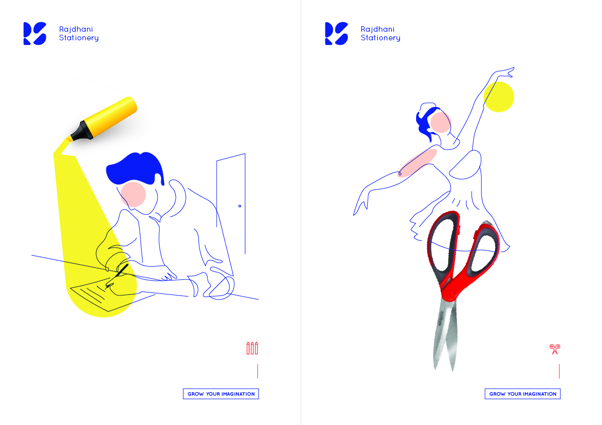
Inspired by minimalism, Azad wanted to move away from any kind of Delhi’s monumental representation or cues to add in the logo as the shop’s name says “Rajdhani”. As a result, he chose a type-based logo.
“I extracted the shapes of stationery items such as set squares and protractor and combine them with initials of the brand.” he shares.
What emerged was a completely unique RS (Rajdhani Stationary) logo which is minimal in its entirety and contains the essence of the brand’s core function, which is to sell stationery items.
Indianama is an initiative of the creative agency Animal. It is an inclusive platform that curates and showcases the work of multi-disciplinary artists, across boundaries.
Follow more from their latest project on Facebook and Instagram.
Featured image credits: Indianama
Written by Anmol Akanksha Nayak